![]()
That’s according to the RMIT University researchers who designed it.
Released yesterday, it’s believed to be the world’s first typeface specifically designed to help people retain information and remember study notes.
Called Sans Forgetica, it’s a back-slanted, gapped font based on another, called Albion, and was a collaboration between a typographic design specialist and psychologists.
So what sets Sans Forgetica apart? Dr Janneke Blijlevens, founding member of the RMIT Behavioural Business Lab, said typical fonts are too familiar.
"Readers often glance over them and no memory trace is created," Blijlevens said. On the flip side, a font too different would be too difficult to process and wouldn't help with recall.
Blijlevens said Sans Forgetica lies at a sweet spot where just enough obstruction has been added to retain information.
Stephen Banham, lecturer in typography, said it subverts the typical conventions of a typeface.
“Normally when you design a typeface, you design it for clarity and easy recognition,” Banham explained. “This was the complete reverse of that. We had to build in elements that actually slowed down people’s reading of the typeface and demanded them to notice it a bit more and want to complete the forms.”
In this way, the font asks something of the reader, he added. “Whereas as if we’re reading that same information in Ariel or Helvetica or Times, we’re so comfortable with those forms that we just race across them – this one slows you down.”
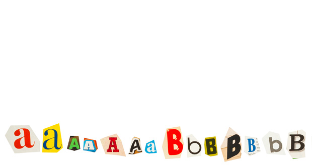
To find a font that achieved that aim, the researchers first developed three new typefaces, each based on Albion but with varying levels of added difficulty – one with gaps; one with gaps and a back slant; and one with gaps, a back slant and asymmetry.
They then recruited 100 Australian university students to look at word pairs written in the three fonts to find out which led to the best memory retention. Participants were able to recall more studied in with an Albion font with gaps and a back slant – which became Sans Forgetica – than the other two fonts.
The team later carried out an online experiment involving a multiple choice exam with 303 students. Participants remembered 57 per cent of the text when a section was typed in Sans Forgetica compared to 50 per cent of the surrounding text that was written in a plain Arial font.
Banham said the disruptive typographic feature of back slanting was chosen because it’s extremely unusual – one typically only used by cartographers when marking the names of river systems – while gaps were chosen because the mind will “immediately want to complete those shapes”.
“It begins to work out where that shape starts and finishes, and it begins to become more engaged with that shape and that’s where the memory gets triggered and that helps the students recall the information better,” he said.
To get the most out of Sans Forgetica, Banham stressed that it should only be used as a highlight font.
“It’s only meant for very small [sections of] text. It could be a small quotation or a particular line of text that a student wants to remember,” he explained. “The more sparingly you use it the greater the power it will continue to have.”
Banham added that the impact of the font is tested but not proven, and said he's interested to see how it's used and what life it has after it’s released to students.
Sans Forgetica has been made available free to download as a font and Chrome browser extension here.
Do you have an idea for a story?Email [email protected]